

V&A MUSEUM MAIN SHOP
ROBOTIC CRAFT REMODEL
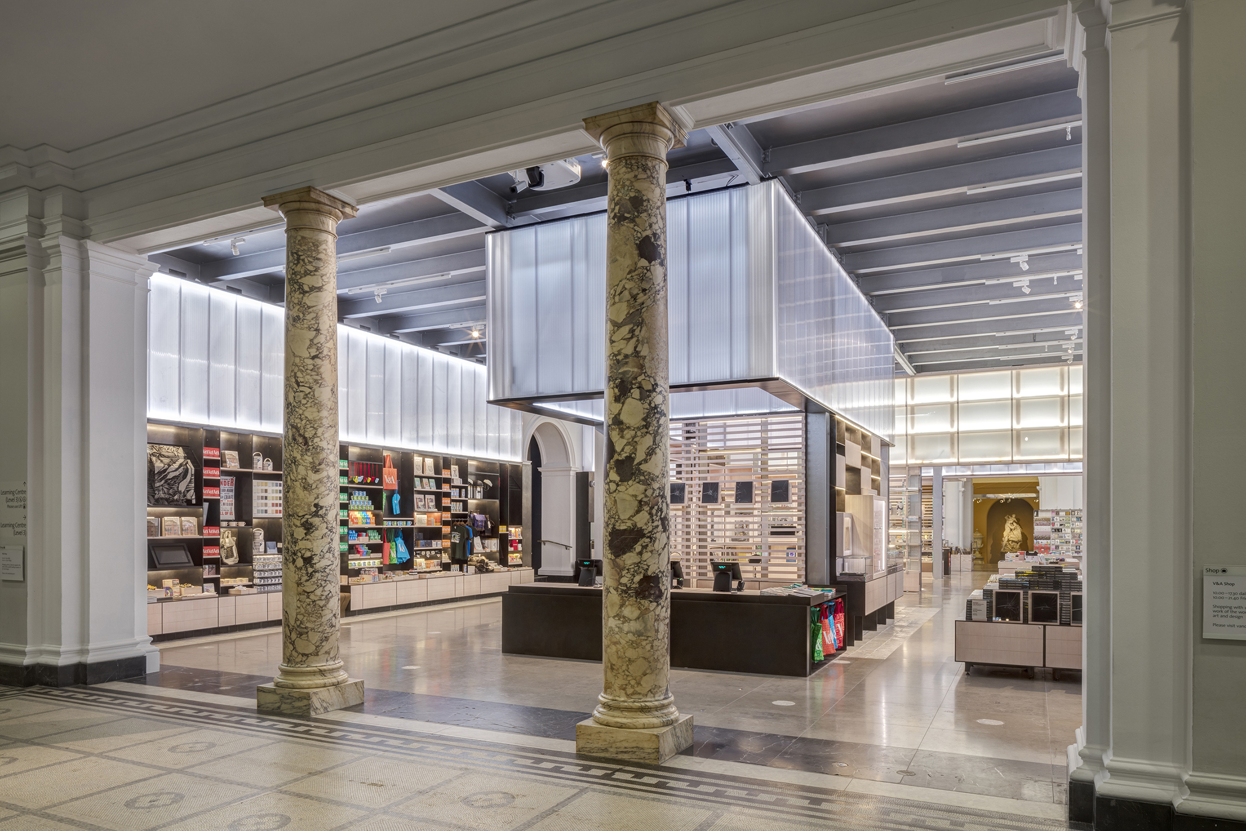
The shop design was inspired by our fascination with digital craft processes and is now as much a showcase of latest building technologies as it is a new space to display new designers work and additions to the museum shop collection.
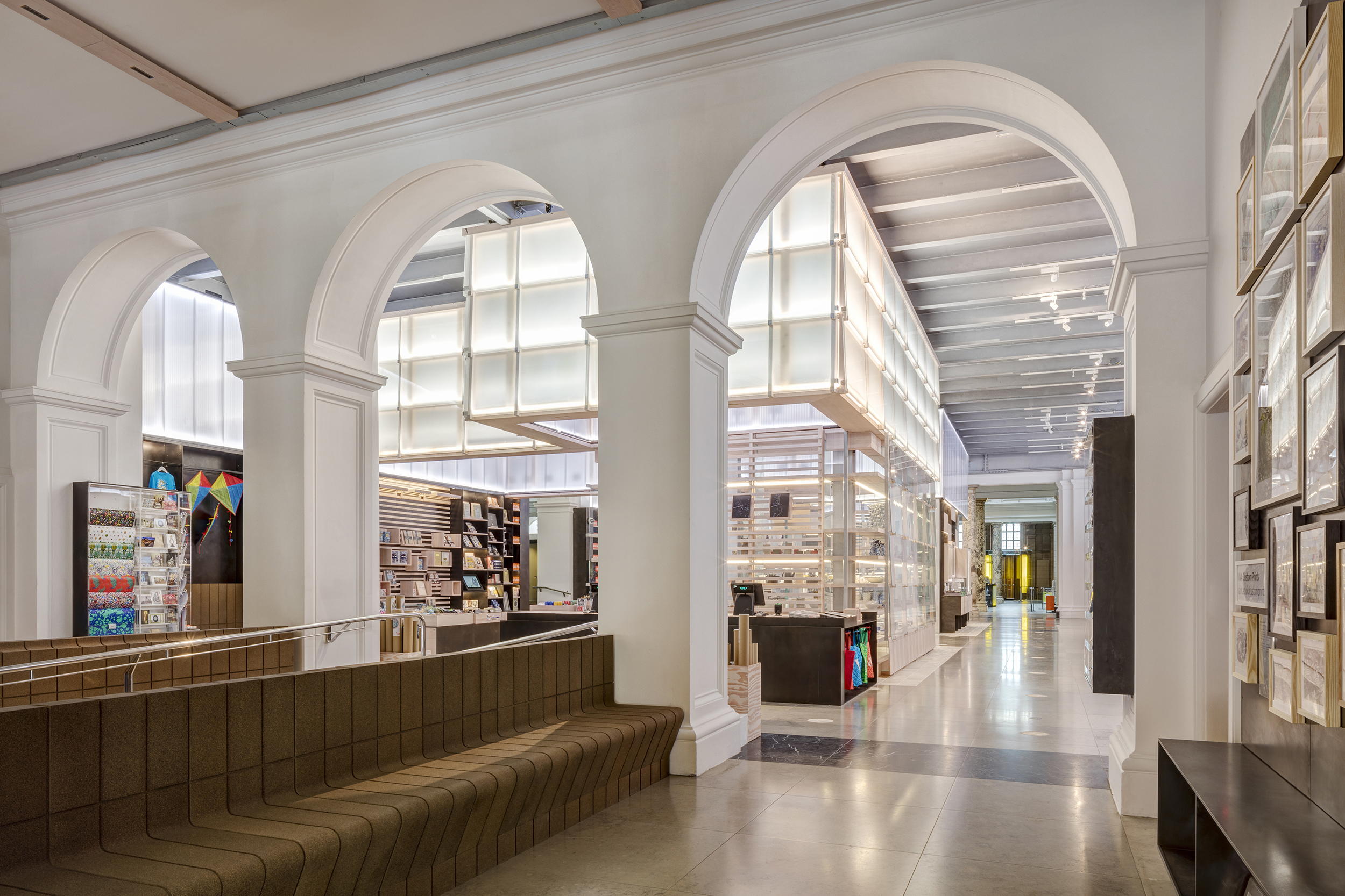
Situated at the heart of the museum, the site is crucial in defining the V&A experience. The V&A archives at Blythe House revealed that the first V&A shop, as early as 1863, was a showcase for new crafts and a place for visitors to connect with the museum catalogues. This remodel, born of our ability to finding connections between museum and retail narratives, created a multi-functional space in tune with the museum, capable of hosting diverse events, as well as classic retail areas responding to an ever more diverse and growing audiences.
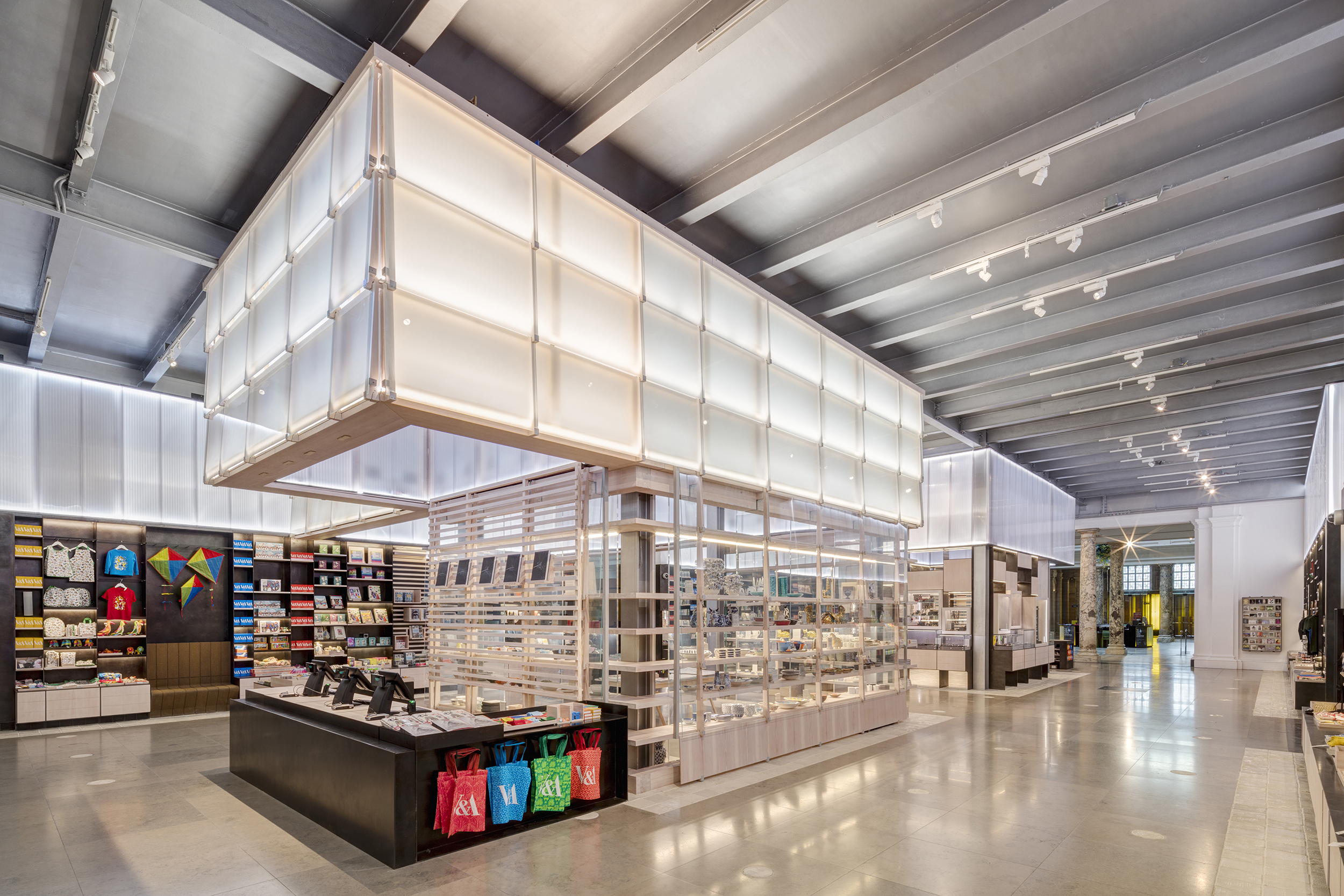
Spatially the new shop substantially increases displayable wall space through a concept of lanes and street facades that grew from a close examination of previously hidden steel structures. A suspended ceiling, installed in the 1970s, was removed to increase height and reveal the historic development of the museum to reveal new narratives connecting the shop merchandising to the museum collections. This structure is echoed with bespoke 10mm mild steel shelving ‘weldments’ that extended the life-span as well as tested future sustainable material choices the museum could adopt in both future exhibition and retail spaces.
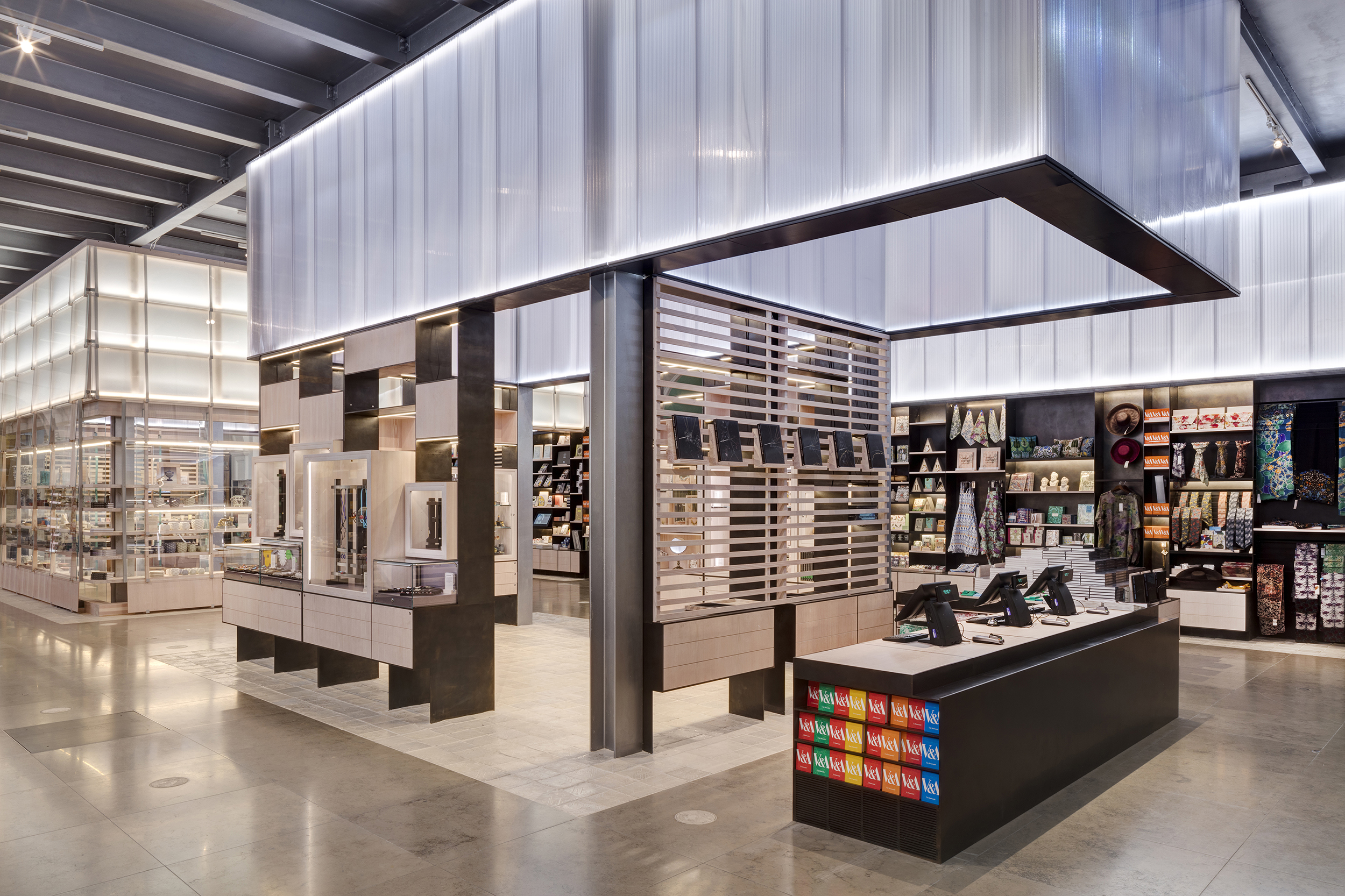
The new Pocket Workshop demonstration space for craft will have a quarterly materials focus, starting with ceramics. A new Jewellery Pavilion shows the collections to their best advantage. Visitors connect with the museum catalogue through these innovative spaces that also recall the material taxonomy of the first V&A shop. It was integral to the museum, selling catalogues and, in the 1860s, lantern slides to allow people to study the exhibits at home.
Both pavilions make use of latest robotic craft and are made from digitally fabricated components that have been beautifully hand-finished. This bespoke 21st Century applied art uses new materials and tailored finishes that are usually only achieved in workshops, and levels of precision normally only found in latest manufacturing technologies. The Jewellery Pavilion is formed of four mild steel ‘weldments' weighing half a ton each. They have been laser-cut to a precise pattern, hand-welded, and finished in a zinc spray that is then patinated.
The Pocket Workshop displays a glass and timber structure in which timber shelves are stacked and slotted into water-jet cut structural glass fins so they appear to float on ‘structural air’. This glass and timber structure is then clad in glass shingles held in place with timber stakes making a ‘shop window’ demonstrator space in which the stories behind the merchandise can be extended and told, offering a gateway into the museum collection and inspire a greater sense of inquiry.
Throughout the design development of the new main shop, the practice has instigated partnerships with craftspeople and worked with the V&A team resulting in exceptional collaborations, such as ︎ the 3D-printed ceramic tile that has been created for segments of the floor designed with Guan Lee of Grymsdyke Farm.
CLIENT
Victoria and Albert Museum, LondonPROJECT YEAR
2018COLLABORATION
Grymsdyke FarmMillimetre
PHOTOS
Ed ReeveAWARDS
Dezeen Awards 2018 - ShortlistedAJ Retrofit Awards 2018 - Shortlisted
Blueprint Magazine Awards 2017 - Highly Commended
PRESS
DezeenWallpaper
AJ
